In this guide, we’ll walk through building a personal story page—“My Journey to Student Advisor”—from a simple prompt to a polished, professional design. You’ll learn not just what prompts to use, but how to think about iterative refinement: identifying what needs improvement, communicating changes precisely, and adapting the process to your actual needs.
Below, explore the journey in three stages: the initial prompt, ChatGPT’s first result, and the final polished design. Then we’ll break down exactly how to get from start to finish using the vocabulary and techniques you learned earlier.
ChatGPT Prompt
Why This Works
Avoid:
Tech Stack:
Understanding AI Results
Large Language Models (LLMs) like ChatGPT are probabilistic models. This means even with the exact same prompt, they can generate different results each time. Think of it as creative variation—not a bug, but a feature that offers multiple solutions to explore.
What to Look For
When you see ChatGPT's result, take notes on:
- What works: Colors, layout, specific text, visual style you like
- What to change: Spacing issues, font choices, missing elements
- Specific elements: Be precise—"the header font" not "the text"
The next section provides terminologies and feedback templates to help you communicate clearly.
The Transformation
This is a simple example, but notice the change: the page feels more elegant, clean, and well-organized.
The layout guides your eye through the story, professional imagery adds visual interest, and interactive elements reveal information progressively.
Small, intentional changes compound into a polished result.
The biggest challenge most people face isn’t getting ChatGPT to generate a website—it’s communicating what needs to change. You might look at the result and know something feels “off,” but struggle to articulate exactly what. This vocabulary gap creates a bottleneck: you iterate slowly because feedback like “make it look better” or “fix the spacing” is too vague for the AI to act on precisely. The solution? Learn the essential design vocabulary that lets you describe exactly what you see and how you want it to feel.
Essential Design Vocabulary
Layout, color, and typography are the three foundational dimensions of web design. Understanding these concepts—and the words to describe them—transforms vague feedback into actionable instructions that ChatGPT can execute immediately. Below you’ll find comprehensive vocabulary for each dimension, helping you communicate exactly what you see and how you want it to feel.
Layout and spacing form the foundation of any website's visual structure. They control how content is organized, how elements relate to each other, and ultimately how the page feels to read.
What It Is
How It Feels
Generous Spacing →
Balanced & Organized →
Tight Spacing →
What to Avoid →
Example: Putting It Into Practice
Color choices define the emotional tone and visual identity of your site. While layout creates structure, color creates mood and personality.
What It Is
Tools to Explore Colors
- Canva Color Wheel — Explore complementary, analogous, triadic schemes
- Coolors — Generate and browse color palettes
How It Feels
Temperature →
Energy & Intensity →
Mood & Atmosphere →
Visual Quality →
Example: Putting It Into Practice
Typography shapes readability and personality. The right font choices make content inviting and accessible, while poor typography frustrates readers.
What It Is
Tools to Explore Fonts
- Google Fonts — Browse thousands of free, open-source fonts
- Adobe Fonts — Premium font library with professional typefaces
How It Feels
Weight & Presence →
Style & Era →
Readability →
Mood & Tone →
Quality →
Example: Putting It Into Practice
Beyond Flat Pages: Dimensional Design Patterns
Now that you have the vocabulary to describe visual elements, let’s explore how to organize them across space and depth. Most people think of web pages as flat, scrolling documents—but the best websites leverage three dimensions:
- X-axis: Horizontal layout (left to right)
- Y-axis: Vertical scroll (up to down)
- Z-axis: Layers and depth (what’s on top of what)
This third dimension is where patterns like tabs, modals, and sidebars live. They manipulate the Z-axis to create spatial hierarchy—organizing information not just by size or position, but by layer and interaction. This is the foundation of information architecture and progressive disclosure: showing the right information at the right time, without overwhelming users.
The patterns below aren’t just UI components—they’re dimensional organization tools. Each one controls how users navigate space, reveal content, and focus attention. Understanding when and how to use them transforms your ability to design (and communicate with ChatGPT about) complex interfaces.
Reveal content on demand to reduce cognitive load
Content for section 1
Content for section 2
Content for section 3
Accordion
Y+Z-axisExpandable sections that reveal content when clicked
Dropdown Menu
Z-axisMenu that appears below a trigger element on interaction
Tooltip
Z-axisSmall contextual help text that appears on hover or focus
Hidden content revealed
on toggle
Collapsible Sections
Y+Z-axisContent sections that can be toggled between visible and hidden states
Main content area
Bottom Sheet
Y+Z-axisMobile-first panel that slides up from the bottom of the screen
File 1
Details revealed on hover
File 2
Rich preview info
Folder
Contains 5 items
Hover Details Panel
Z-axisRich preview panel that appears when hovering over items
Demand attention by layering above the main content
Modal/Dialog
Z-axisOverlay window that appears on top of page content, requiring user interaction
Drawer (Side Panel)
X+Z-axisPanel that slides in from the side of the screen, overlaying content
Quick Action
Popover
Z-axisSmall overlay attached to a trigger element, showing rich content
Create visual depth and dynamic interactions
Carousel
X+Z-axisRotating content display that cycles through items horizontally
Scroll down to see effect ↓
Background moves at different speed
Parallax Scrolling
Z-axisBackground and foreground elements move at different speeds to create depth illusion
Applying the Vocabulary: Step-by-Step Refinement
Now let’s apply everything you’ve learned. Below is a refinement process showing how to iterate on our student advisor story page using the vocabulary and patterns from earlier sections. These prompts are examples - your ChatGPT outputs will vary, so adapt them based on what you actually see. Focus on the thinking process and how precise vocabulary transforms into actionable instructions.
Review Content & Key Messages
Before jumping into design, take time to think
Consider These Questions:
- What are the 2-3 key messages I want visitors to remember?
- Is my content organized in a logical flow that's easy to follow?
- Does each section serve a clear purpose, or is there unnecessary information?
- Are my main points distinct from each other and clearly articulated?
- Could any section be more concise or impactful?
Why This Matters:
Content clarity comes before visual design. You can't design well without clear messaging. Taking time to refine your story's structure and key messages now will make all the design steps that follow much more effective.
Make Small, Targeted Changes
Goal: Refine specific elements one at a time
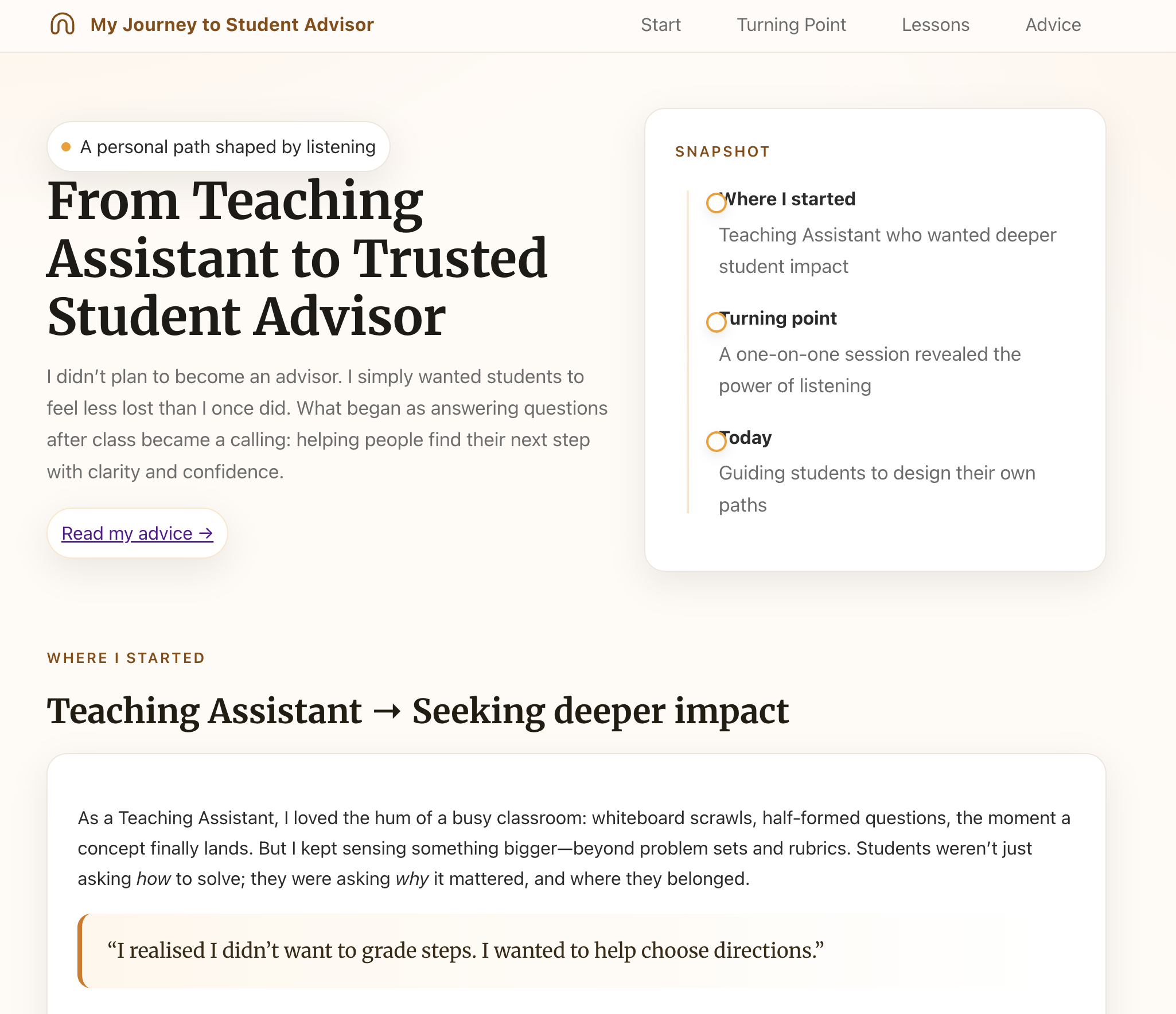
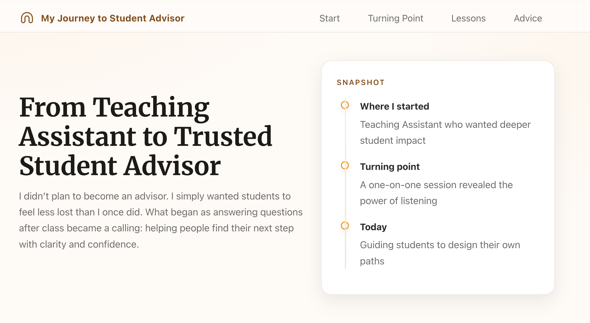
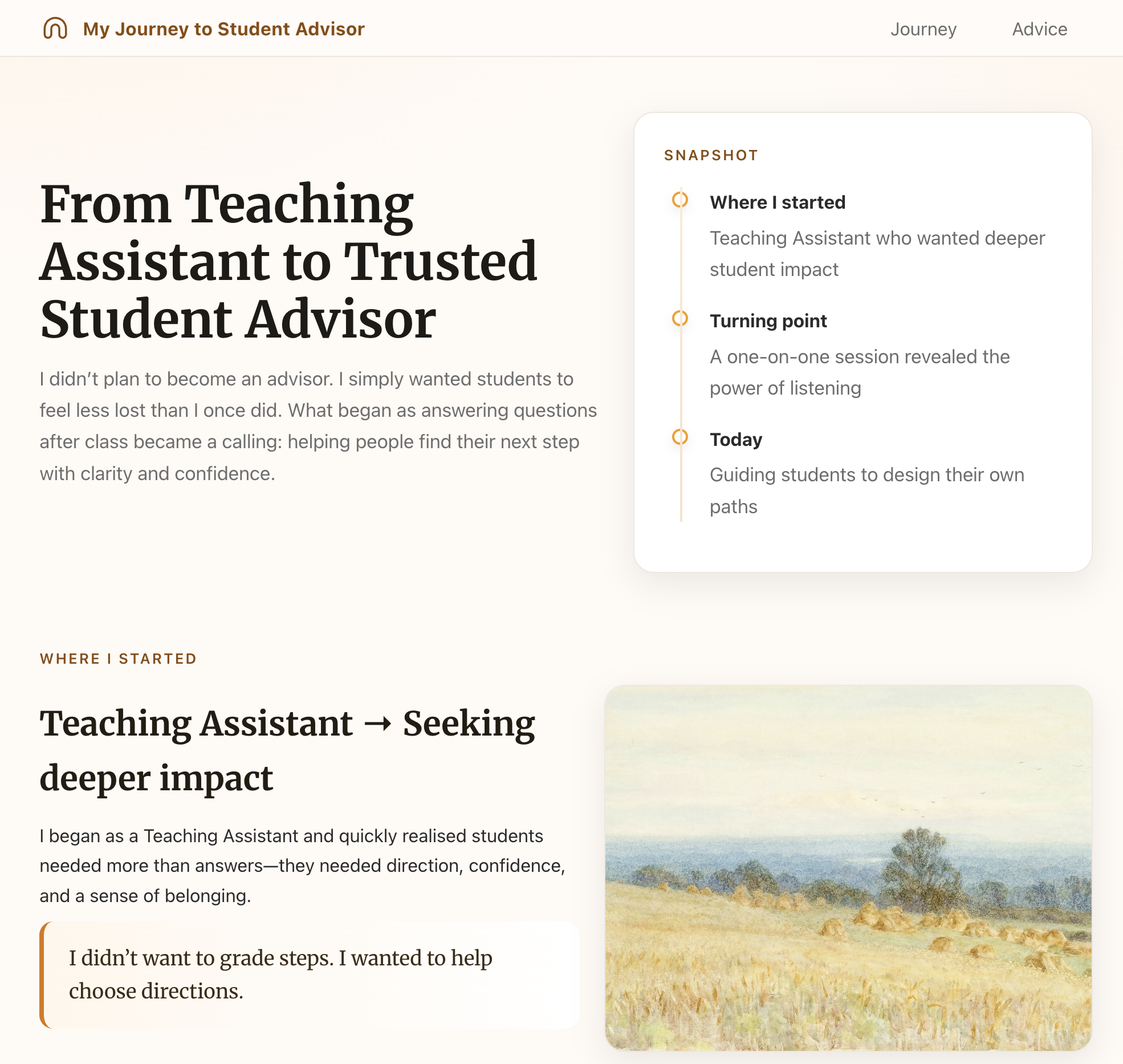
Looking at the current page, let's make targeted improvements:

1. Remove unnecessary decorative elements:
 - Remove the "A Person Shaped by Listening" card above the lessons section
 - Remove the "Read my advice" section at the bottom
 - Keep the design minimal and focused on the core story

2. Fix the timeline alignment:
 - The milestone circles aren't aligned with the vertical timeline line
 - Position circles directly centered on the line
 - Make sure milestone text aligns properly with each circle
What Changed:
- • Cleaner, more minimal design by removing unnecessary cards and sections
- • Timeline visual hierarchy fixed - easier to follow the journey chronologically
- • Each change targeted a specific issue rather than overwhelming redesign
Organize with Layout & Patterns
Goal: Create visual rhythm with alternating image-text sections
Let's organize the story sections with alternating image-text layout:

1. Create three distinct sections:
 - "Where I Started"
 - "Turning Point"
 - "Key Lessons Learned"

2. Use alternating layout pattern:
 - Section 1: Image on RIGHT, key message on LEFT
 - Section 2: Image on LEFT, key message on RIGHT
 - Section 3: Image on RIGHT, key message on LEFT

3. Layout specifications:
 - Two-column grid (50/50 split on desktop, stack on mobile)
 - Increase vertical padding to 4rem between sections
 - Remove colored left borders - keep design clean and minimal
 - Add generous white space around text (3rem padding)
 - Set max-width to 1200px, center container

4. Use placeholder images for now (we'll add specific photos later)

This creates visual rhythm and guides the eye through the narrative.
What Changed:
- • Tried tabs first but they felt too UI-heavy for a story - alternating sections flow better
- • Alternating image-text pattern creates visual rhythm that keeps readers engaged
- • Clean two-column grid with generous spacing makes content easy to scan
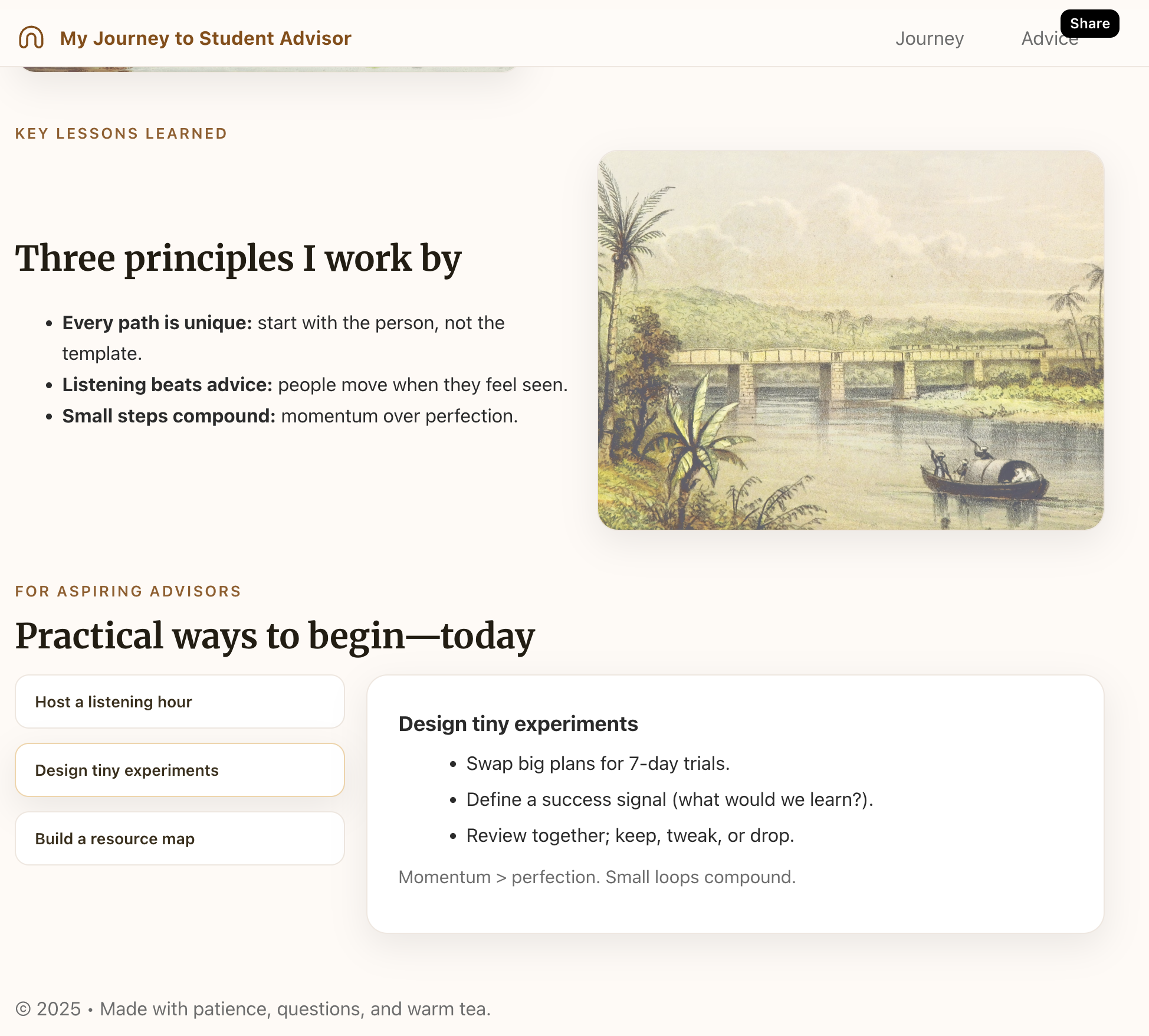
Add Interactive Details & Polish
Goal: Enhance with hover panels and professional imagery
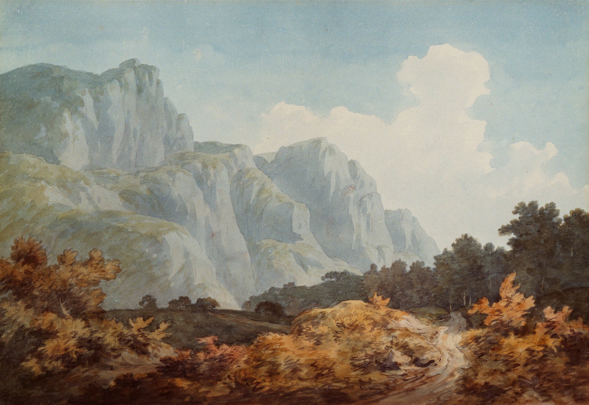
Let's add final touches to complete the design:

1. Add hover detail panels for "Practical Ways to Begin" section:
 - Display each tip as a card
 - Show brief preview text
 - On hover, expand with full details (hover details panel pattern)
 - Use smooth transitions (0.3s ease)
 - Subtle shadow on hover: 0 4px 6px rgba(0,0,0,0.1)

2. Replace placeholder images with professional Unsplash photos:
 - High-quality, well-composed imagery
 - Relevant to each section's theme
 - Consistent style and tone across all three sections

3. Final polish:
 - Ensure consistent spacing throughout
 - Check mobile responsiveness (panels stack on small screens)
 - Test all hover interactions work smoothly
What Changed:
- • Hover detail panels add progressive disclosure - users get previews without overwhelming content
- • Professional Unsplash photography elevates the entire design and makes it more engaging
- • Skipped typography and color refinement since the layout already looked polished - adapt the process to your needs
Building Your Design Intuition
As AI tools take over code generation, design becomes the creative work. ChatGPT can write HTML, CSS, and JavaScript for you—but it needs you to articulate the vision. This is where the real skill lies: developing the language to describe what you want and the taste to know what looks good.
Learning design vocabulary is just the beginning. Building great AI-assisted products requires ongoing practice: follow industry trends, study well-designed sites, understand why certain layouts feel right. The resources below will help you develop your aesthetic intuition and stay inspired. Think of them as your design education—the more you observe, the better you’ll communicate with AI.
Design Resources
Explore these curated resources to continue your design education:
| Category | Resource | What It Is | Why Use It |
|---|---|---|---|
| Inspiration | Dribbble | Platform for designers showcasing UI/UX work | See cutting-edge design trends from top designers |
| Inspiration | Behance | Portfolio platform with detailed case studies | Study full project presentations and design thinking |
| Inspiration | Awwwards | Award-winning websites with innovative design | Learn from sites judged by industry experts |
| Inspiration | Mobbin | Mobile app screenshots and user flows | Study real app interfaces and interaction patterns |
| Typography | Google Fonts | Free font library with web integration | Easy to use, well-optimized, completely free |
| Typography | Typewolf | Font recommendations from real websites | Learn which fonts pair well in context |
| Colors | Coolors | Color palette generator | Quickly generate harmonious color schemes |
| Colors | Color Hunt | Curated color palettes | Browse pre-made palettes for inspiration |
| Images | Unsplash | High-quality free stock photography | Professional images for any project, completely free |
| Images | Pexels | Free stock photos and videos | Alternative to Unsplash with video options |
| Icons | Heroicons | Hand-crafted SVG icons | Beautiful, consistent icons from Tailwind makers |
| Icons | Lucide | Modern icon library with 1000+ icons | Clean, consistent, actively maintained, MIT licensed |
| Icons | Feather Icons | Simple, clean icon set | Minimal, elegant icons that work anywhere |
| Patterns | Component Gallery | Interface components from real products | See how components are designed across systems |
| Patterns | Laws of UX | Design principles and psychology | Understand why certain patterns work better |